The Ultimate Guide to Graph Correlation: Positive/Negative and Dissertation|2025
Explore the ultimate guide to graph correlation. Learn how to visualize relationships between variables, interpret results, and enhance your data analysis skills effectively.
Understanding the relationship between two variables is a cornerstone of data analysis, and correlation analysis is one of the most widely used statistical tools to achieve this. Correlation measures the strength and direction of a linear relationship between two variables. Graphical representations of correlation, such as scatter plots and correlation graphs, provide intuitive insights into these relationships. This guide delves into the concepts of positive and negative correlation, discusses the correlation coefficient, explores examples, and introduces the five types of correlation.
What Is Correlation?
Correlation quantifies the degree to which two variables move together. When one variable changes, the correlation indicates whether the other variable tends to change in the same direction (positive correlation), in the opposite direction (negative correlation), or if there is no discernible relationship (zero correlation).
Correlation is typically represented mathematically by the correlation coefficient, denoted as r. The value of r ranges from -1 to +1, with:
- r = 1: Perfect positive correlation
- r = -1: Perfect negative correlation
- r = 0: No correlation
Positive Correlation
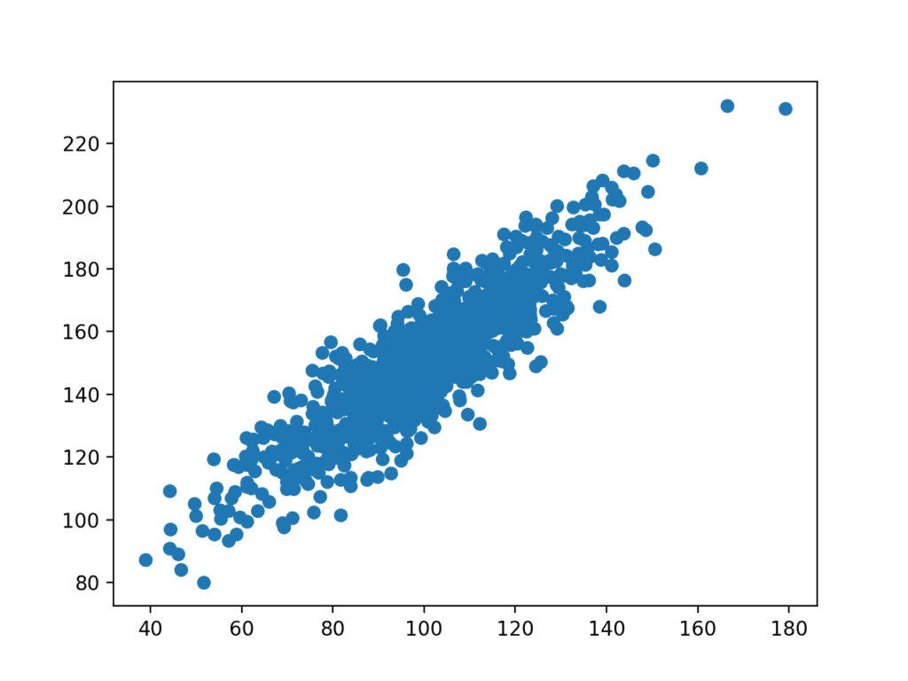
Positive correlation occurs when two variables increase or decrease together. For example, the more hours a student studies, the higher their exam scores tend to be. This relationship can be visualized using a positive correlation scatter plot where data points form an upward-sloping pattern.
Positive Correlation Graph Example:
Consider a scenario where you analyze the relationship between the number of hours spent exercising and calories burned. Plotting this data on a scatter plot reveals an upward trend—indicating a positive correlation.
Characteristics:
- Direction: The graph slopes upward from left to right.
- Strength: Determined by the proximity of data points to the best-fit line. The closer the points are to the line, the stronger the positive correlation.
- Examples:
- The relationship between years of education and income levels.
- The connection between marketing budget and sales revenue.
Negative Correlation
Negative correlation occurs when one variable increases while the other decreases. For instance, as the speed of a car increases, the time taken to reach a destination decreases. This inverse relationship can be illustrated using a negative correlation scatter plot, where data points form a downward-sloping pattern.
Negative Correlation Graph Example:
Suppose you analyze the relationship between daily coffee consumption and hours of sleep. A scatter plot might show a downward trend, signifying a negative correlation.
Characteristics:
- Direction: The graph slopes downward from left to right.
- Strength: Similar to positive correlation, the strength is gauged by the closeness of data points to the line of best fit.
- Examples:
- The relationship between temperature and heating costs.
- The connection between screen time and sleep quality.
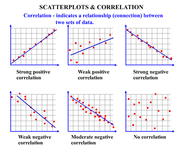
Correlation Coefficient: Strong or Weak?
The correlation coefficient (r) is a numerical measure that indicates the strength and direction of a linear relationship between two variables. The interpretation of r values is as follows:
Strength:
- Strong Correlation:
- |r| > 0.7
- Example: A strong positive correlation (≈ 0.85) between physical activity and cardiovascular health.
- Example: A strong negative correlation (≈ -0.75) between age and flexibility.
- Moderate Correlation:
- 0.4 ≤ |r| ≤ 0.7
- Example: A moderate positive correlation (≈ 0.5) between study time and test performance.
- Example: A moderate negative correlation (≈ -0.6) between smoking frequency and lung capacity.
- Weak Correlation:
- |r| < 0.4
- Example: A weak positive correlation (≈ 0.2) between daily water intake and skin elasticity.
- Example: A weak negative correlation (≈ -0.3) between screen brightness and battery life.
Direction:
- Positive (r > 0): Variables move in the same direction.
- Negative (r < 0): Variables move in opposite directions.
- Zero (r = 0): No linear relationship exists.

Scatter Diagram Correlation Examples
Scatter diagrams are visual tools that depict the relationship between two variables. Each point represents a pair of values from the dataset.
Example 1: Positive Correlation
Imagine a dataset tracking the hours spent practicing an instrument and the resulting proficiency scores. A scatter diagram reveals an upward-sloping pattern, affirming a positive correlation.
Example 2: Negative Correlation
Consider data on car mileage and fuel efficiency. A scatter plot might display a downward-sloping pattern, indicating that higher mileage correlates with lower fuel efficiency.
Example 3: No Correlation
If we plot shoe size against intelligence quotient (IQ), the scatter diagram would likely show no discernible pattern, indicating zero correlation.
What Are the 5 Types of Correlation?
- Positive Correlation:
- Variables increase together.
- Example: The relationship between height and weight.
- Negative Correlation:
- One variable increases while the other decreases.
- Example: The relationship between elevation and temperature.
- Zero Correlation:
- No relationship exists between variables.
- Example: The relationship between hair color and academic performance.
- Linear Correlation:
- Data points form a straight-line pattern.
- Example: The relationship between distance and time at a constant speed.
- Non-Linear (Curvilinear) Correlation:
- Data points form a curved pattern.
- Example: The relationship between stress levels and performance, which follows an inverted U-shape (Yerkes-Dodson Law).
Practical Applications of Correlation
Academic Research
Correlation analysis is indispensable in dissertation writing, where researchers often explore relationships between variables to support hypotheses. For instance, a study on the impact of social media usage on mental health might reveal a negative correlation.
Business Insights
Businesses use correlation to identify trends and make data-driven decisions. For example, analyzing the correlation between advertising spend and customer acquisition rates can optimize marketing strategies.
Healthcare
In healthcare, correlation helps identify risk factors for diseases. For instance, researchers might explore the correlation between smoking and lung cancer incidence.
Conclusion
Understanding correlation is crucial for analyzing and interpreting data effectively. Positive and negative correlations, the correlation coefficient, scatter plots, and the five types of correlation form the foundation of this concept. Whether you’re a student, researcher, or business analyst, mastering these principles will enhance your ability to draw meaningful insights from data. By combining graphical tools and numerical measures, correlation analysis provides a comprehensive view of relationships, empowering informed decision-making across various domains.
Needs help with similar assignment?
We are available 24x7 to deliver the best services and assignment ready within 3-4 hours? Order a custom-written, plagiarism-free paper