Understanding SPSS Charts and Graphs: A Visual Guide|2025
Why Use Charts in SPSS?
- Data Interpretation: Simplify complex datasets.
- Highlight Trends: Showcase patterns and relationships.
- Effective Communication: Enhance the impact of presentations and reports.
Keywords to Highlight
- SPSS charts and graphs
- How to create graphs in SPSS
- Visual data analysis in SPSS
- SPSS bar charts tutorial
- Learn SPSS graph customization
Step 1: Navigating the SPSS Graph Menu
Before diving into specific chart types, familiarize yourself with the Graph menu in SPSS.
- Accessing the Chart Builder:
- Navigate to Graphs > Chart Builder from the main menu.
- Understanding the Interface:
- Gallery Tab: Browse pre-built templates for different chart types.
- Variables Panel: Drag and drop variables onto axes or chart elements.
- Element Properties: Customize the appearance and settings of your chart.
Pro Tip
Always ensure your dataset is clean and variables are properly defined in the Variable View before creating graphs.
Step 2: Creating Bar Charts
Bar charts are ideal for comparing categorical data. Follow these steps to create a bar chart in SPSS:
- Open the Chart Builder:
- Click Graphs > Chart Builder.
- Select Bar Chart:
- Choose “Bar” from the Gallery Tab.
- Assign Variables:
- Drag the categorical variable to the X-Axis.
- Drag the numerical variable to the Y-Axis.
- Customize the Chart:
- Use the Element Properties to adjust colors, labels, and bar orientation.
- Generate the Chart:
- Click OK to create the bar chart.
Common Uses for Bar Charts
- Comparing sales across regions.
- Analyzing survey responses.
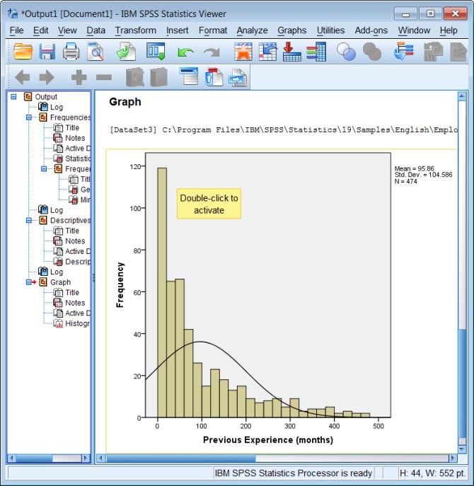
Step 3: Using Histograms for Distributions
Histograms provide a visual representation of data distribution. Here’s how to create one:
- Navigate to Chart Builder:
- Click Graphs > Chart Builder.
- Choose Histogram:
- Select “Histogram” from the Gallery Tab.
- Drag Variables:
- Place the variable you want to analyze on the X-Axis.
- Adjust Bin Width:
- Use the Element Properties to define the range of bins.
- View the Histogram:
- Click OK.
Key Insights
- Understand the central tendency and spread of data.
- Detect skewness or outliers.
Step 4: Creating Scatter Plots
Scatter plots are used to examine relationships between two continuous variables.
- Access Chart Builder:
- Go to Graphs > Chart Builder.
- Select Scatter/Dot:
- From the Gallery Tab, choose a scatter plot template.
- Assign Variables:
- Drag one variable to the X-Axis and another to the Y-Axis.
- Add Fit Line (Optional):
- In Element Properties, select “Fit Line” to include a trendline.
- Generate the Plot:
- Click OK to view the scatter plot.
Applications
- Visualizing correlations.
- Exploring predictive relationships.
Step 5: Designing Pie Charts
Pie charts are perfect for showing proportions. Here’s how to create one in SPSS:
- Go to Chart Builder:
- Navigate to Graphs > Chart Builder.
- Choose Pie Chart:
- Select “Pie” from the Gallery Tab.
- Assign Variables:
- Drag a categorical variable to the Slice By section.
- Customize Labels:
- Use Element Properties to display percentages or counts.
- Create the Chart:
- Click OK.
Use Cases
- Displaying survey results.
- Visualizing budget allocations.
Step 6: Customizing Charts
Customization allows you to tailor charts for specific audiences. Use the following tools:
- Chart Editor:
- Double-click on a chart to open the Chart Editor.
- Change Colors:
- Adjust color schemes for clarity.
- Add Titles and Labels:
- Include descriptive titles and axis labels for context.
- Resize Elements:
- Modify the size of bars, points, or slices.
- Save as Template:
- Save frequently used designs for consistency across projects.
Step 7: Exporting Charts
Exporting charts ensures you can use them in presentations or reports. Here’s how:
- Right-click on the Chart:
- In the Output Viewer, right-click the chart.
- Export Options:
- Choose Export > Chart Only.
- Select File Format:
- Save as JPEG, PNG, or PDF.
Step 8: Troubleshooting Common Issues
Charts Not Displaying Correctly
- Check Variable Assignments: Ensure variables are correctly placed on axes.
- Clean the Data: Remove missing or erroneous entries.
Chart Builder Errors
- Verify that variable types (e.g., numeric vs. categorical) match the chart requirements.
Step 9: Advanced Charting Techniques
- Boxplots:
- Ideal for visualizing variability and outliers.
- Found under Graphs > Chart Builder > Boxplot.
- Clustered Bar Charts:
- Compare multiple categories side by side.
- Select “Clustered Bar” from the Gallery Tab.
- Dual-Axis Charts:
- Combine two chart types for complex visualizations.
- Use syntax for advanced customizations.
Step 10: Using Syntax for Charts
SPSS Syntax allows for automation and reproducibility.
Example
GGRAPH
  /GRAPHDATASET NAME="graphdataset" VARIABLES=age job_satisfaction
  /GRAPHSPEC SOURCE=INLINE.
BEGIN GPL
  SOURCE: s=userSource(id("graphdataset"))
  DATA: age=col(source(s), name("age"))
  DATA: job_satisfaction=col(source(s), name("job_satisfaction"))
  GUIDE: axis(dim(1), label("Age"))
  GUIDE: axis(dim(2), label("Job Satisfaction"))
  ELEMENT: point(position(age*job_satisfaction))
END GPL.
Conclusion
Understanding SPSS charts and graphs is crucial for effective data visualization. By mastering these techniques, you can present data in a compelling way that highlights trends, relationships, and insights. Whether you’re a beginner or an advanced user, SPSS provides all the tools you need to make your data speak visually.
Start practicing today to become proficient in creating impactful visualizations using SPSS!
Needs help with similar assignment?
We are available 24x7 to deliver the best services and assignment ready within 3-4 hours? Order a custom-written, plagiarism-free paper


