Customizing SPSS Graphs and Charts|2025
/in SPSS Articles /by BesttutorIBM SPSS Statistics is a powerful statistical software package widely used in social sciences, healthcare, market research, and many other fields to analyze data and perform statistical modeling. One of the critical aspects of SPSS is its ability to create visual representations of data, such as graphs and charts, which allow users to interpret their results more easily. Customizing these graphs and charts is an essential skill for producing professional-quality reports and presentations.
This paper delves into the process of customizing SPSS graphs and charts, focusing on the various types of graphs, how to modify them, and how to interpret them in the context of complex datasets. The paper will also explore key techniques, such as customizing SPSS graphs and charts online, creating line graphs with multiple variables, adjusting the Y-axis scale, and utilizing the SPSS Chart Editor.
Table of Contents
ToggleTypes of Graphs in SPSS
SPSS offers a wide range of graph types to represent data in different ways, each tailored to display specific patterns or trends in the data. Common graph types include:
- Bar Graphs: These are ideal for comparing categorical data. They display data as rectangular bars with lengths proportional to the values they represent.
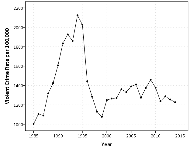
- Line Graphs: These graphs are used to display continuous data and are especially useful for showing trends over time, particularly when dealing with multiple variables.
- Pie Charts: Pie charts represent proportions and are often used when you want to show how individual parts contribute to a whole.
- Scatter Plots: Scatter plots display the relationship between two continuous variables, with each point representing an individual data point. They are useful for identifying correlations.
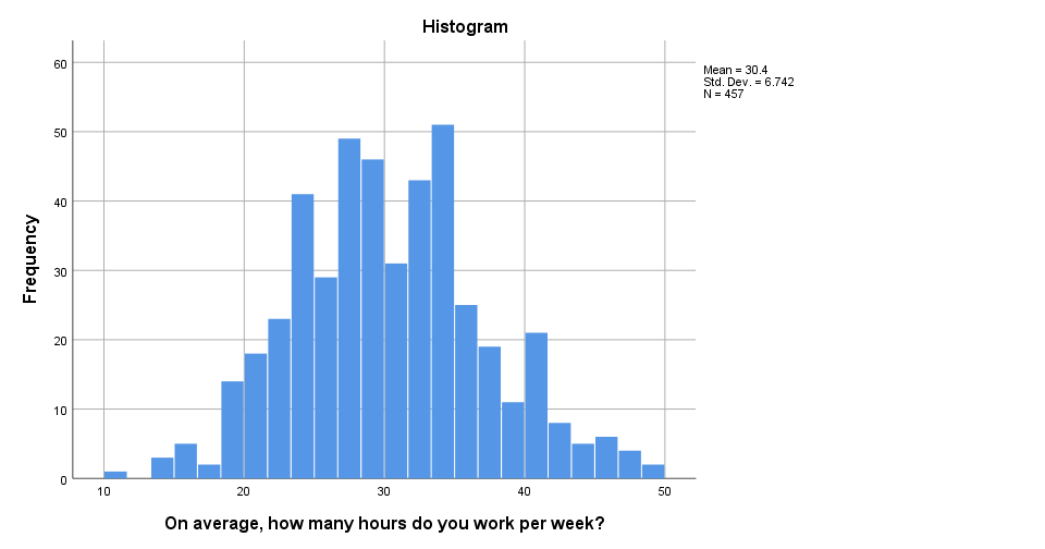
- Histograms: Histograms are used for displaying the frequency distribution of a continuous variable. They show the number of observations within each interval of the data.
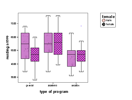
- Box Plots: These represent the distribution of numerical data through their quartiles and are useful for identifying outliers and understanding the spread of data.
SPSS also supports several specialized graphs, such as stacked bar charts, dot plots, and area charts, depending on the data structure and research needs.
How to Create Graphs in SPSS
Creating graphs in SPSS is straightforward and can be done through the Chart Builder. The following steps outline how to create a basic graph:
- Open the Data Set: Start by loading the dataset that you intend to analyze.
- Access the Chart Builder: Navigate to
Graphson the top menu and selectChart Builder. This opens the Chart Builder window. - Select a Graph Type: In the Chart Builder, you will find different categories of graph types. Drag and drop the appropriate type of graph you wish to create into the chart preview area.
- Define Variables: For the selected graph, assign the relevant variables to the axes or other parts of the graph. For example, in a bar chart, drag the categorical variable to the x-axis and the numerical variable to the y-axis.
- Customize the Graph: You can customize various elements of the graph such as the colors, labels, and axis titles.
- Generate the Graph: Once the graph is customized, click
OKto generate it. The graph will appear in the output viewer, where further customization can be done through the Chart Editor.
SPSS Chart Editor
The SPSS Chart Editor is a powerful tool used to refine and adjust graphs that have already been created. Once a graph is generated, it can be customized further using the Chart Editor. The following modifications are commonly made:
- Changing Axis Scales: The Y-axis and X-axis scales can be adjusted by double-clicking on the axis in the Chart Editor. This opens a dialog box where you can set specific limits, increments, and display formats.
- Adding Titles and Labels: Titles, axis labels, and legends can be edited to provide clarity. This is important for presenting graphs in a readable and professional manner.
- Adjusting Colors and Styles: You can change the colors of bars, lines, or other graphical elements. This allows you to match the graph’s appearance to a specific theme or branding.
- Incorporating Data Labels: Data labels can be added to graphs to display specific values on the chart. This can help the viewer better understand the exact values represented by the graph.
- Annotations: The Chart Editor allows users to add annotations, such as arrows or text boxes, to emphasize certain parts of the graph.
The Chart Editor provides a flexible environment for refining the presentation of your data and ensuring that your graphs convey the right message.
Customizing SPSS Graphs and Charts IBM
IBM’s version of SPSS provides advanced options for customizing graphs. These customizations are particularly important for tailoring visual representations to specific analytical needs. Here are a few techniques for customizing SPSS graphs:
- Multivariate Graphs: SPSS allows you to plot multiple variables on the same graph. For example, you can overlay multiple line graphs to compare trends across variables. To do this, choose the Line Chart type and then assign multiple variables to the
y-axis. - Layered Graphs: IBM SPSS supports the layering of different types of graphs on a single plot. For instance, you could overlay a scatter plot on top of a line graph to show how two variables relate over time.
- Use of Themes: SPSS allows you to apply predefined themes to your graphs, which can quickly give your charts a consistent and polished look. This is especially useful in professional reporting, where visual uniformity is key.
- Interactive Graphs: With SPSS, you can create interactive charts, particularly when exporting your graphs to web formats. These charts allow users to explore the data in real-time, zooming in and out, and examining different data points.
SPSS Line Graph Multiple Variables
A line graph is one of the most effective ways to represent continuous data and visualize trends over time. In SPSS, it is possible to create a line graph with multiple variables, which allows you to compare trends across several datasets simultaneously.
To create a line graph with multiple variables in SPSS, follow these steps:
- Open the Data File: Ensure that your dataset contains multiple continuous variables that you want to compare.
- Select Graph Type: Go to the Chart Builder and choose Line as the graph type.
- Assign Variables: Drag your primary variable to the x-axis and assign each of the variables you want to compare to the
y-axis. You can either create multiple lines or use different line types for each variable. - Customize the Graph: Use the Chart Editor to adjust line styles, add labels, and change axis scales to improve the clarity of the graph.
The result will be a multi-line graph where each line represents a variable, allowing you to compare trends across different variables over the same range of values.
SPSS Graph Multiple Variables
When analyzing multiple variables simultaneously, it can be helpful to use different types of graphs to illustrate relationships between the variables. SPSS allows you to create multi-variable graphs in several ways:
- Bar Graphs with Multiple Variables: In the Bar Graph Chart Builder, you can create grouped or stacked bar charts to represent multiple variables. Grouped bar charts display the variables side by side, while stacked bar charts stack the values on top of one another.
- Scatter Plots for Multiple Variables: In scatter plots, you can represent multiple variables by plotting several series on the same graph. You can differentiate between series using different colors or shapes for each data set.
- Clustered Boxplots: Clustered boxplots allow you to compare the distributions of a continuous variable across several categorical variables. This is particularly useful for comparing subgroups within your data.
How to Change Y-Axis Scale in SPSS
Changing the Y-axis scale in SPSS is a straightforward task that can significantly affect the interpretability of your graph. In the Chart Editor, follow these steps:
- Select the Y-Axis: Double-click on the Y-axis of your graph to open the axis properties dialog.
- Adjust the Scale: In the properties window, you can set specific minimum and maximum values for the Y-axis, adjust the interval between ticks, and modify the axis labels. This is useful when you need to zoom in on a particular range of values or if you want to standardize the scale across multiple graphs.
- Logarithmic Scales: For data that spans several orders of magnitude, you might want to use a logarithmic scale. SPSS provides this option, and it can help make patterns in such data more visible.
- Reversing the Axis: In some cases, you may need to reverse the Y-axis (e.g., to show descending values). This can be done directly from the properties window in the Chart Editor.
Customizing SPSS Graphs and Charts Online
Customizing SPSS graphs and charts online refers to the ability to create, edit, and share SPSS graphs through online platforms or interfaces. While SPSS itself is primarily a desktop application, there are several ways to use SPSS outputs in an online context:
- Export to Online Formats: SPSS allows you to export graphs as image files (e.g., PNG, JPEG) or in vector formats (e.g., SVG) for use in online publications and presentations.
- Use of Online SPSS Tools: There are third-party platforms that allow you to import SPSS files for analysis and graph customization. These platforms can provide additional flexibility and features for presenting data online.
- Interactive Dashboards: For more advanced users, SPSS can be integrated with online data visualization tools, such as Tableau or Power BI, which allow users to create interactive dashboards with SPSS data.
Conclusion
Customizing graphs and charts in SPSS is an essential skill for effective data presentation. SPSS provides a range of tools for creating and modifying different types of graphs, from bar charts to line graphs and scatter plots. The use of the Chart Editor, customizing axis scales, and handling multiple variables on a single graph are all vital steps for refining visualizations and ensuring clarity in analysis. Moreover, SPSS allows for advanced customization, such as adding interactive features and exporting graphs for online use, which can further enhance the usability and presentation of statistical findings.
By mastering these techniques, users can significantly improve the quality of their data presentations, making it easier for others to interpret complex statistical results.
GetSPSSHelp stands out as a premier choice for SPSS assignment assistance due to its team of highly qualified experts with extensive knowledge in statistical analysis and software usage. The platform is committed to ensuring timely delivery of assignments, even when deadlines are tight, without compromising on quality. By offering personalized solutions tailored to the specific requirements of each student, GetSPSSHelp guarantees accuracy and relevance in every assignment. The service is also highly affordable, combining competitive pricing with premium quality standards. Furthermore, its 24/7 customer support ensures that students receive prompt and reliable assistance, making it a dependable partner for all SPSS-related academic needs.
Needs help with similar assignment?
We are available 24x7 to deliver the best services and assignment ready within 3-4 hours? Order a custom-written, plagiarism-free paper