Descriptive Statistics: Overview with Definition, Types, and Examples|2025
Descriptive statistics is a branch of statistics that involves the use of numerical and graphical techniques to describe and summarize data. This branch of statistics provides simple summaries about the sample and the measures, which can be used for further analysis or interpretation. It is an essential part of data analysis, especially when dealing with large datasets. Descriptive statistics helps in simplifying large amounts of data into more interpretable formats without making inferences or predictions about a larger population. The goal is to represent the data in a way that is easy to understand.
This paper explores the concept of descriptive statistics, its types, how to interpret it, real-life examples, and how to write a descriptive statistics analysis.
:max_bytes(150000):strip_icc()/Descriptive_statistics-5c8c9cf1d14d4900a0b2c55028c15452.png)
What is Descriptive Statistics?
Descriptive statistics refers to the methods used to summarize and describe the main features of a dataset. Unlike inferential statistics, which makes predictions or inferences about a population based on sample data, descriptive statistics focuses solely on summarizing the data that is already available. Descriptive statistics can be computed for any kind of data and can be visualized using charts, graphs, tables, or numerical summaries.
For example, if a researcher collects data on the heights of 50 individuals, the researcher could use descriptive statistics to summarize the dataset with measures such as the mean height, median, and mode, as well as graphical representations such as histograms or box plots.
Types of Descriptive Statistics
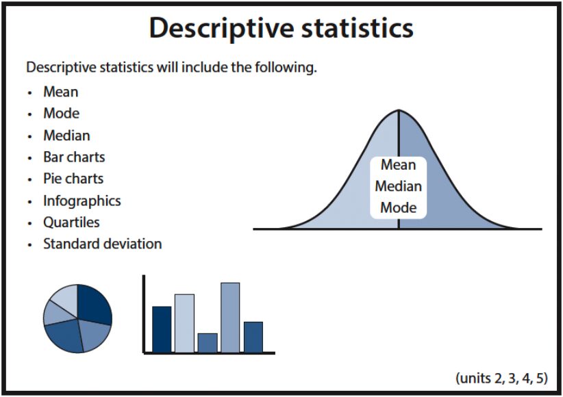
Descriptive statistics is generally divided into two categories: numerical (or quantitative) and graphical. These two categories allow researchers to represent data in different ways, providing a fuller picture of the dataset’s key characteristics.
Numerical Descriptive Statistics
Numerical descriptive statistics include measures of central tendency and measures of variability or spread. These are computed using the raw data.
a) Measures of Central Tendency
These measures represent the central point or typical value of a dataset. The most common measures of central tendency are:
- Mean: The mean is the arithmetic average of all the data points. It is calculated by adding all the data points and dividing the sum by the total number of data points. The mean is widely used but can be sensitive to extreme values (outliers).Example: If the heights of five individuals are 160 cm, 170 cm, 175 cm, 180 cm, and 190 cm, the mean height is:Mean=160+170+175+180+1905=8755=175 cm\text{Mean} = \frac{160 + 170 + 175 + 180 + 190}{5} = \frac{875}{5} = 175 \, \text{cm}
- Median: The median is the middle value of a dataset when the data points are arranged in ascending or descending order. If the number of data points is odd, the median is the middle number. If it’s even, the median is the average of the two middle numbers. The median is less sensitive to outliers than the mean.Example: If the same set of heights (160 cm, 170 cm, 175 cm, 180 cm, 190 cm) is arranged in order, the median is 175 cm, since it is the middle value.
- Mode: The mode is the value that appears most frequently in the dataset. A dataset can have one mode, more than one mode, or no mode at all.Example: If the heights are 160 cm, 170 cm, 170 cm, 180 cm, 190 cm, the mode is 170 cm because it appears twice.
b) Measures of Variability or Dispersion
These measures provide an understanding of how spread out the data is. Common measures of variability include:
- Range: The range is the difference between the maximum and minimum values in the dataset.Example: For the dataset of heights (160 cm, 170 cm, 175 cm, 180 cm, 190 cm), the range is:Range=190−160=30 cm\text{Range} = 190 – 160 = 30 \, \text{cm}
- Variance: Variance measures the average degree to which each data point differs from the mean. It is useful for understanding the dispersion of the data, though it is measured in squared units.Example: To calculate the variance for the above dataset, the deviations of each data point from the mean (175 cm) are squared, and the average of these squared deviations is calculated.
- Standard Deviation: The standard deviation is the square root of the variance and provides a measure of how spread out the numbers in the dataset are. A low standard deviation indicates that the data points tend to be close to the mean, whereas a high standard deviation indicates that the data points are spread out over a wider range.Example: If the variance of the heights dataset is 25, then the standard deviation is:Standard Deviation=25=5 cm\text{Standard Deviation} = \sqrt{25} = 5 \, \text{cm}
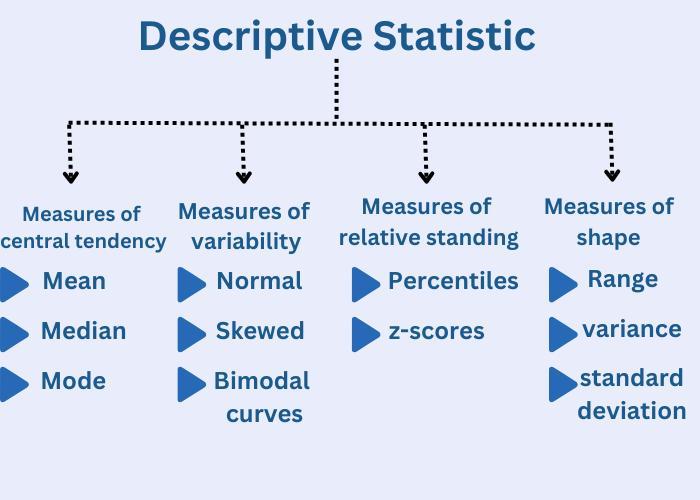
Graphical Descriptive Statistics
Graphical representations make it easier to see patterns and trends in the data. Some of the most common graphical representations are:
- Bar Charts: Bar charts are used to represent categorical data with rectangular bars. The length of each bar is proportional to the value of the category it represents.
- Histograms: A histogram is similar to a bar chart but is used to represent the distribution of a continuous variable. The data is grouped into intervals or bins, and the height of each bar represents the frequency of data points within that bin.
- Pie Charts: Pie charts represent data in a circular format, where each “slice” represents a category’s proportion of the whole dataset.
- Box Plots: A box plot, or box-and-whisker plot, provides a graphical representation of the distribution of data based on a five-number summary: minimum, first quartile, median, third quartile, and maximum.
- Scatter Plots: A scatter plot is used to represent the relationship between two continuous variables. Each point in the plot represents a data point with values for the two variables.
Real-Life Examples of Descriptive Statistics
Descriptive statistics is widely used across different fields to summarize data and gain insights. Here are a few real-life examples:
- Education: Teachers may use descriptive statistics to analyze test scores. For instance, they can calculate the mean, median, and mode of students’ scores to understand the overall performance of the class. A box plot may also be used to identify outliers in scores.
- Healthcare: Descriptive statistics are used in healthcare to summarize patient data. For example, a hospital might analyze the average age of patients, the distribution of diseases, or the length of hospital stays. These statistics help in managing healthcare services more efficiently.
- Business: A company might use descriptive statistics to analyze sales data. A business might calculate the mean sales of a product across several regions, identify the mode of the most popular product, or analyze the standard deviation to understand the variability in sales.
- Sports: In sports, coaches use descriptive statistics to summarize the performance of athletes. For example, the average score of a player in a season can be computed, or a scatter plot can be used to visualize the relationship between training time and performance.
- Social Science: Researchers in social sciences use descriptive statistics to summarize demographic data, such as the average age, income, or education level of a population. This helps in understanding trends and making policy recommendations.
How to Interpret Descriptive Statistics
Interpreting descriptive statistics involves understanding the summary measures of central tendency and variability. For example:
- If the mean and median are close to each other, it indicates that the data is symmetrically distributed. However, if there is a large difference between the two, it may suggest that the data is skewed.
- A high standard deviation means that the data points are spread out, whereas a low standard deviation suggests that the data points are clustered near the mean.
- The presence of outliers can be detected using a box plot or by looking at the range and interquartile range (IQR).
How to Write a Descriptive Statistics Analysis
Writing a descriptive statistics analysis involves summarizing the data in a clear and concise manner, using appropriate statistical methods and graphical representations. The analysis should include:
- Introduction: Provide a brief overview of the dataset and the purpose of the analysis.
- Methodology: Describe the statistical methods used to analyze the data, such as calculating the mean, median, standard deviation, or creating a histogram.
- Results: Present the key statistical findings. Include measures like the mean, median, mode, range, and standard deviation. Use tables and graphs to make the results clearer.
- Interpretation: Provide a discussion of what the results mean in the context of the dataset. For example, if the standard deviation is large, you can discuss the spread of the data and potential reasons for variability.
- Conclusion: Summarize the findings and suggest any next steps for further analysis.

Conclusion
Descriptive statistics is an essential part of data analysis, providing valuable insights into data by summarizing key aspects of a dataset. By using measures of central tendency, variability, and graphical representations, descriptive statistics makes data more accessible and interpretable. It helps to identify patterns, trends, and outliers, laying the foundation for more advanced analyses.
For anyone conducting research or involved in data-driven fields, understanding how to apply and interpret descriptive statistics is critical. Whether through mean, median, and mode, or visualizations like histograms and box plots, these tools help bring clarity to complex datasets. Writing a descriptive statistics analysis involves not only calculating the right measures but also interpreting them in context, ensuring that the analysis is both meaningful and useful.
Needs help with similar assignment?
We are available 24x7 to deliver the best services and assignment ready within 3-4 hours? Order a custom-written, plagiarism-free paper