How to Graph Correlation Analysis with SPSS Statistics: A Step-by-Step Guide|2025
Learn how to graph correlation analysis with SPSS Statistics. Discover the steps to visualize relationships between variables and enhance your data analysis presentations.
In statistics, correlation analysis is a fundamental method used to determine the strength and direction of the relationship between two or more variables. It is an essential tool for understanding data patterns and making informed decisions based on statistical insights. In this paper, we will explore how to graph correlation analysis using SPSS Statistics, a widely used software package for statistical analysis. The focus will be on creating correlation plots, interpreting Pearson correlations, and understanding the relationship between variables through various graphing techniques.

Introduction to Correlation Analysis in SPSS
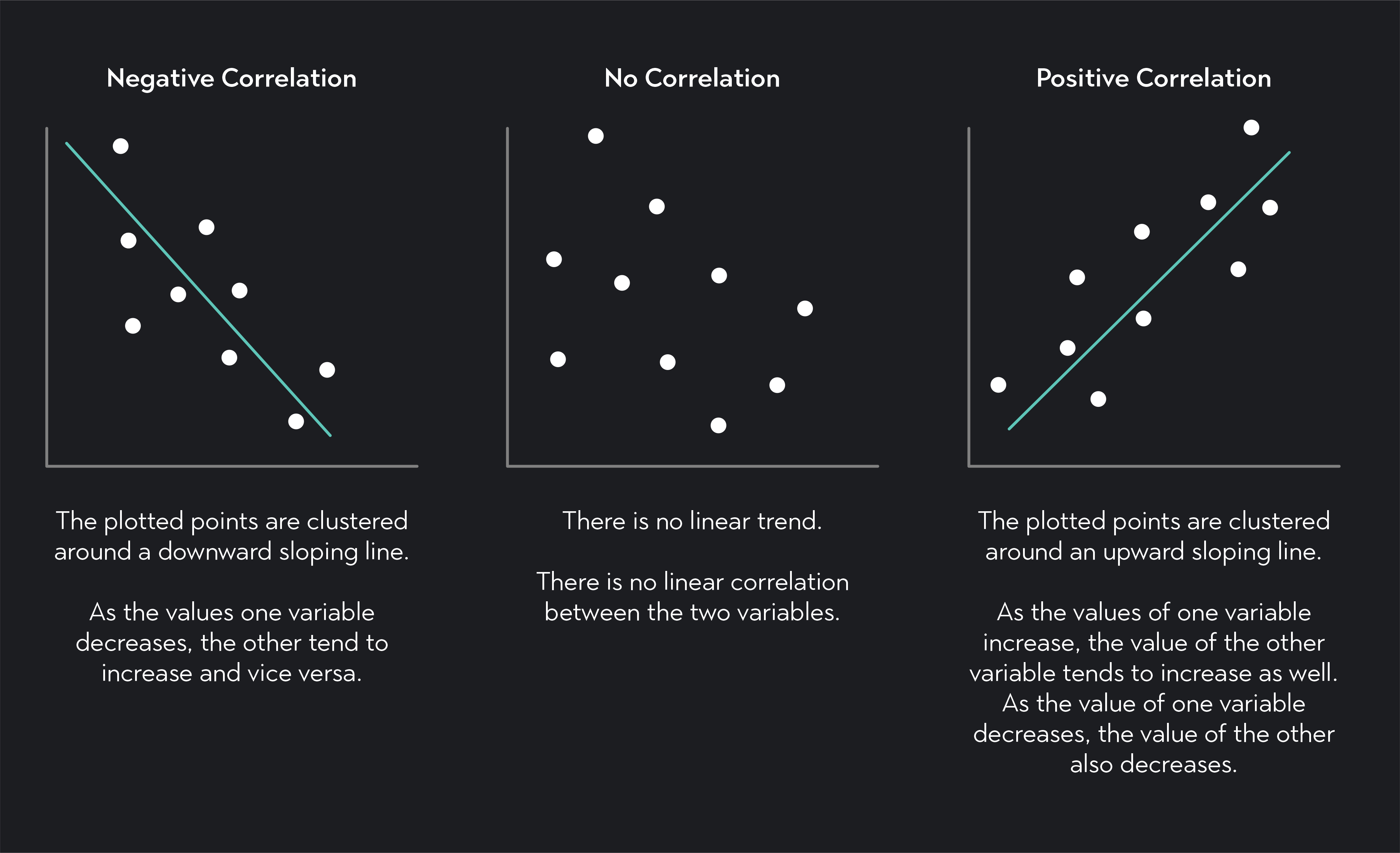
Correlation analysis is used to determine the degree to which two variables are related. This relationship can be expressed as a correlation coefficient, where a value of 1 indicates a perfect positive relationship, -1 indicates a perfect negative relationship, and 0 indicates no relationship. The most commonly used correlation method is Pearson’s correlation, which measures linear relationships between continuous variables.
SPSS (Statistical Package for the Social Sciences) is one of the most popular tools used for performing statistical analysis, including correlation analysis. This software provides various options for both computing correlation coefficients and visually representing the relationships between variables through graphs.
How to Graph Correlation Analysis with SPSS Statistics
To graph correlation analysis in SPSS Statistics, you will typically follow a step-by-step process that involves running the correlation procedure and then plotting the results using scatter plots or other appropriate visualizations. Below is a guide on how to perform correlation analysis and graph the results.
Step 1: Preparing Your Data
Before conducting correlation analysis, ensure that your data is organized in a manner that makes it suitable for analysis. This typically means having two or more continuous variables that you want to explore for relationships. The data should be entered in columns within SPSS.
- Variable selection: Identify the two (or more) variables that you will use for correlation analysis.
- Data entry: Ensure that your data is free from errors such as missing values or outliers.
Step 2: Performing Correlation Analysis in SPSS
Once the data is ready, you can perform the correlation analysis using the following steps:
- Navigate to the “Analyze” menu: In SPSS, go to the “Analyze” menu, choose “Correlate,” and then select “Bivariate” for analyzing the relationship between two continuous variables.
- Select the variables: In the dialog box, select the variables you wish to include in the correlation analysis. You can choose multiple pairs of variables if you want to conduct several correlation tests at once.
- Choose the correlation coefficient: In most cases, you will select the Pearson correlation coefficient, as it is the most commonly used measure of linear correlation.
- Choose options: You can select options such as the significance level (usually 0.05) to test the hypothesis of no correlation and choose whether to display the correlation matrix or not.
- Click “OK”: SPSS will generate a correlation table that shows the Pearson correlation coefficients for each pair of selected variables.
How to Graph Correlation Analysis Using SPSS
Once you have computed the correlation coefficients, the next step is to visualize the relationships between the variables. SPSS provides several ways to graph the results of correlation analysis, with scatter plots being the most common method.
Step 3: Creating a Scatter Plot in SPSS
A scatter plot is one of the best ways to graphically represent the relationship between two continuous variables. To create a scatter plot in SPSS:
- Navigate to the “Graphs” menu: In SPSS, click on the “Graphs” menu and select “Chart Builder.”
- Select scatter plot type: In the Chart Builder dialog box, drag the “Scatter/Dot” icon into the chart preview area.
- Assign variables: Drag the variables you wish to plot onto the X and Y axes. This will generate a scatter plot that shows the relationship between the two variables.
- Add a regression line (optional): To further illustrate the linear relationship, you can add a regression line to the scatter plot. Right-click on the plot and choose “Add Fit Line” or “Linear Fit Line” to display the regression line.
- Customize the plot: Customize the plot by adding titles, axis labels, and adjusting the scale for clarity.
- Click “OK”: Once you are satisfied with the scatter plot, click “OK” to generate the plot in the output window.
Step 4: Creating a Scatter Plot with Multiple Variables in SPSS
If you want to visualize the correlation between multiple variables in a scatter plot, SPSS provides the ability to create matrix scatter plots. This method plots several variables against one another to display all pairwise relationships in one visual.
- Navigate to the “Graphs” menu: Select “Graphs,” then “Legacy Dialogs,” and finally choose “Scatter/Dot.”
- Select “Matrix” scatter plot: In the dialog box, select the “Matrix” option to generate a matrix of scatter plots for multiple variables.
- Assign variables: Move the selected variables into the “Variables” box to plot all pairwise correlations between the selected variables.
- Click “OK”: SPSS will generate a matrix of scatter plots for all the variables, allowing you to visually inspect the relationships between them.
Interpreting the Correlation Table in SPSS
The correlation table generated by SPSS shows the Pearson correlation coefficients between the selected variables. Understanding how to interpret this table is essential for making meaningful conclusions from your analysis. Here’s how to interpret the Pearson correlation table in SPSS:
- Correlation Coefficient: This value, located in the body of the table, indicates the strength and direction of the relationship between the two variables. A value close to 1 suggests a strong positive relationship, while a value close to -1 indicates a strong negative relationship. A value close to 0 suggests no significant linear relationship.
- Significance (p-value): In the table, SPSS also provides the significance (p-value) of the correlation. If the p-value is less than the chosen significance level (usually 0.05), you can reject the null hypothesis of no correlation and conclude that a significant relationship exists between the variables.
- Sample Size (N): The N value represents the number of valid cases used in the correlation analysis.
Pearson Correlation in SPSS
Pearson’s correlation coefficient (r) is the most commonly used measure of linear correlation. It assesses the degree to which two continuous variables are linearly related. A Pearson correlation can range from -1 (perfect negative correlation) to +1 (perfect positive correlation).
How to Perform Pearson’s Correlation in SPSS:
To perform a Pearson correlation in SPSS:
- Go to the “Analyze” menu: Select “Correlate” and then “Bivariate.”
- Select variables: Choose the continuous variables you want to analyze for linear correlation.
- Select Pearson correlation: In the correlation options, select “Pearson” as the method of correlation.
- Check the significance: Make sure to select the option to display the significance value.
- Run the analysis: Click “OK” to generate the correlation table with Pearson’s r.
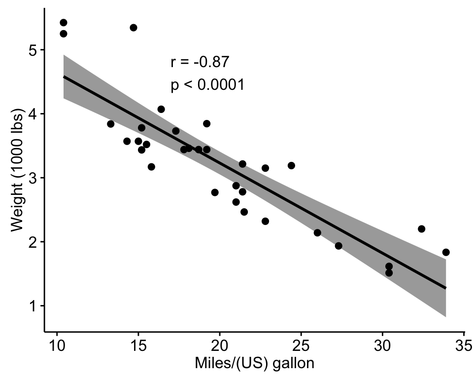
Scatter Plot with Regression Line in SPSS
A scatter plot with a regression line allows you to visually assess the relationship between two variables and understand how one variable predicts the other.
How to Add a Regression Line in SPSS:
- Generate a scatter plot: Follow the steps above to create a basic scatter plot.
- Add regression line: Right-click on the scatter plot and select “Add Fit Line” or “Linear Fit Line” from the context menu.
- Interpret the regression line: The regression line shows the line of best fit, which helps in understanding the linear relationship between the variables. A steep slope indicates a strong relationship, while a flatter slope indicates a weaker relationship.

Conclusion
Graphing and interpreting correlation analysis in SPSS Statistics is a valuable skill that can help researchers and analysts visualize the relationships between variables. By understanding how to create scatter plots, interpret Pearson correlation coefficients, and utilize regression lines, you can gain deeper insights into your data. SPSS Statistics provides powerful tools for performing and graphing correlation analysis, making it an essential tool for anyone involved in statistical research and data analysis.
To graph correlation analysis effectively, it is important to understand the underlying statistical concepts and to choose the appropriate graphical methods, such as scatter plots and correlation matrices, to best represent the data. These visualizations enhance your ability to interpret complex relationships in a clear and accessible way.
Needs help with similar assignment?
We are available 24x7 to deliver the best services and assignment ready within 3-4 hours? Order a custom-written, plagiarism-free paper